Using Tiny Charts To Form My Opinion
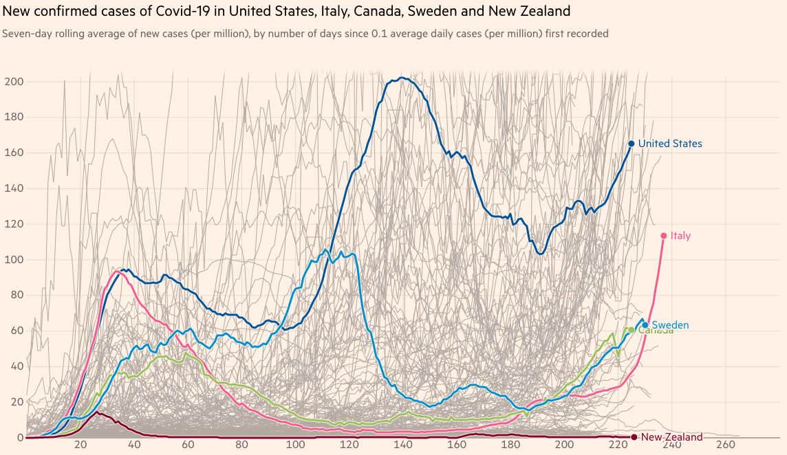
As I hear news stories about COVID-19 trends, I like to look at data to form my own opinion if the narratives are in line with the data. I often want to compare current numbers to the high-water marks for bellweather countries and states. For international COVID data visualizations, my favorite site is Financial Times’ Coronavirus Chart.
I like to see the metrics per 1M people so I can compare countries, regardless of their size. Here are the countries I usually compare:
- Italy as the one the earliest and hardest hit
- Sweden as a country that took a different approach
- Canada as our neighbor to the north
- New Zealand as a country that took aggressive measures
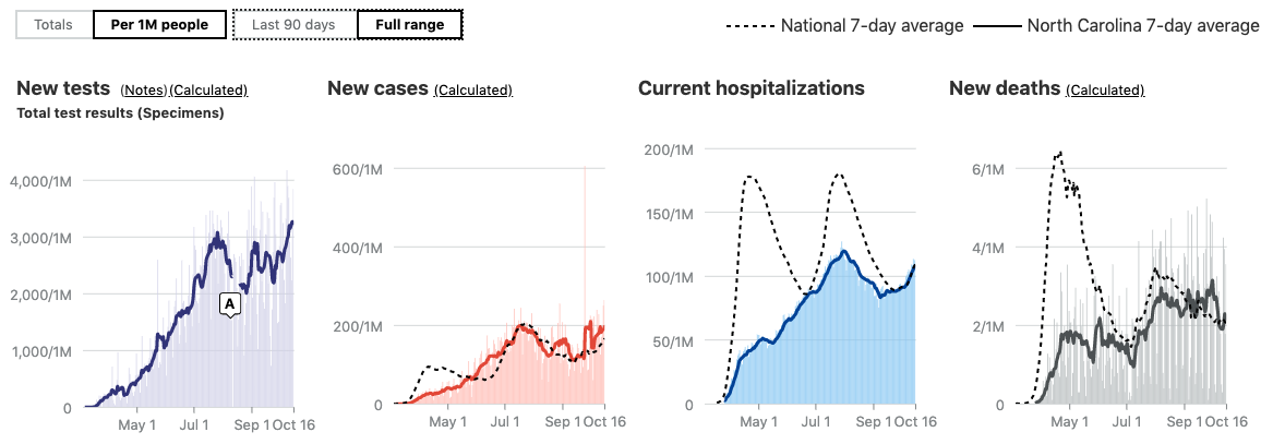
For state data, I really like The Atlantic’s COVID Tracking Project (CTP) visualizations. They use a nice national trend line when looking at the data per 1M people.
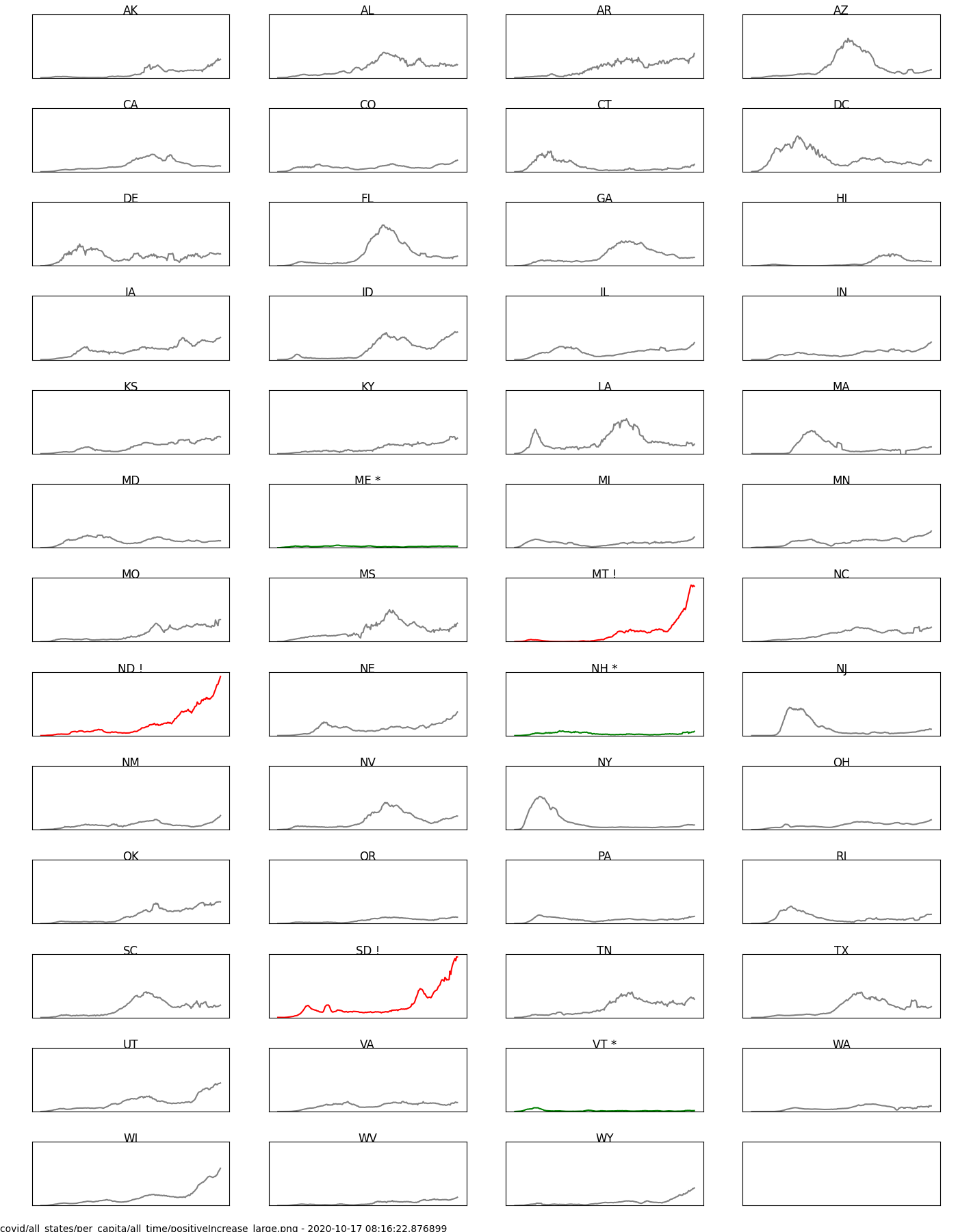
Even with these nice sites, I kept craving a state-based, small multiples chart to allow me to compare states to each other along with the narrative of the virus in the US. Small multiples are simple graphs using the same X and Y axis maximum values to allow you to scan across them to find outliers and make comparisons. They avoid typical chart must-haves like axis labels and tick marks allowing you to focus on relative comparisons. I wanted a chart to look theses states:
- NC as my home state
- NY as the first and hardest hit
- CA as the biggest state
- AZ and FL as early opening states with significant surges
- DC, MD, and VA as the area where I group up
I finally caved and wrote a script to create variations of small multiples of the CTP data. I colored the lines for states trending up and down in the last week to help with finding current trends. It’s led me to some interesting observations:
- The Dakotas and Montana are worse now in new positive cases (per capita) than NY, AZ, and FL ever were.
-
DC had a NY-like trend in new positive cases (per capita). That was not a big story nationally (at least not in NC) but that might be due to the news cycle focus on racial injustice during that time.

-
AR has a surprising high amount of recent deaths per 1M people.

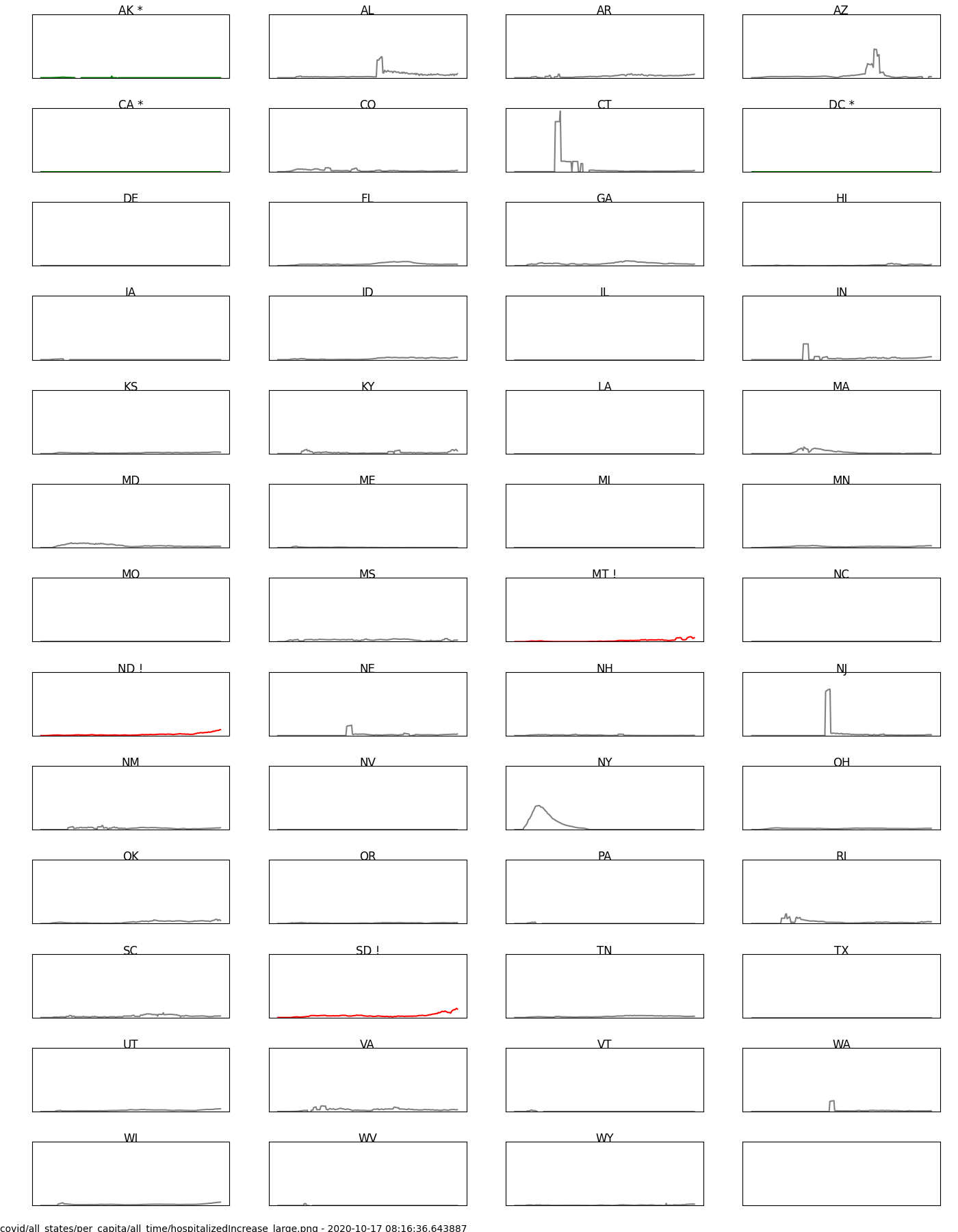
- Hospitalization data is hard. Many states didn’t start collecting this data until later in the pandemic leading to late and odd data spikes.
- Not surprisingly, the most total new cases (not per 1M people) are in the states with the biggest populations: CA, TX, FL, and NY.
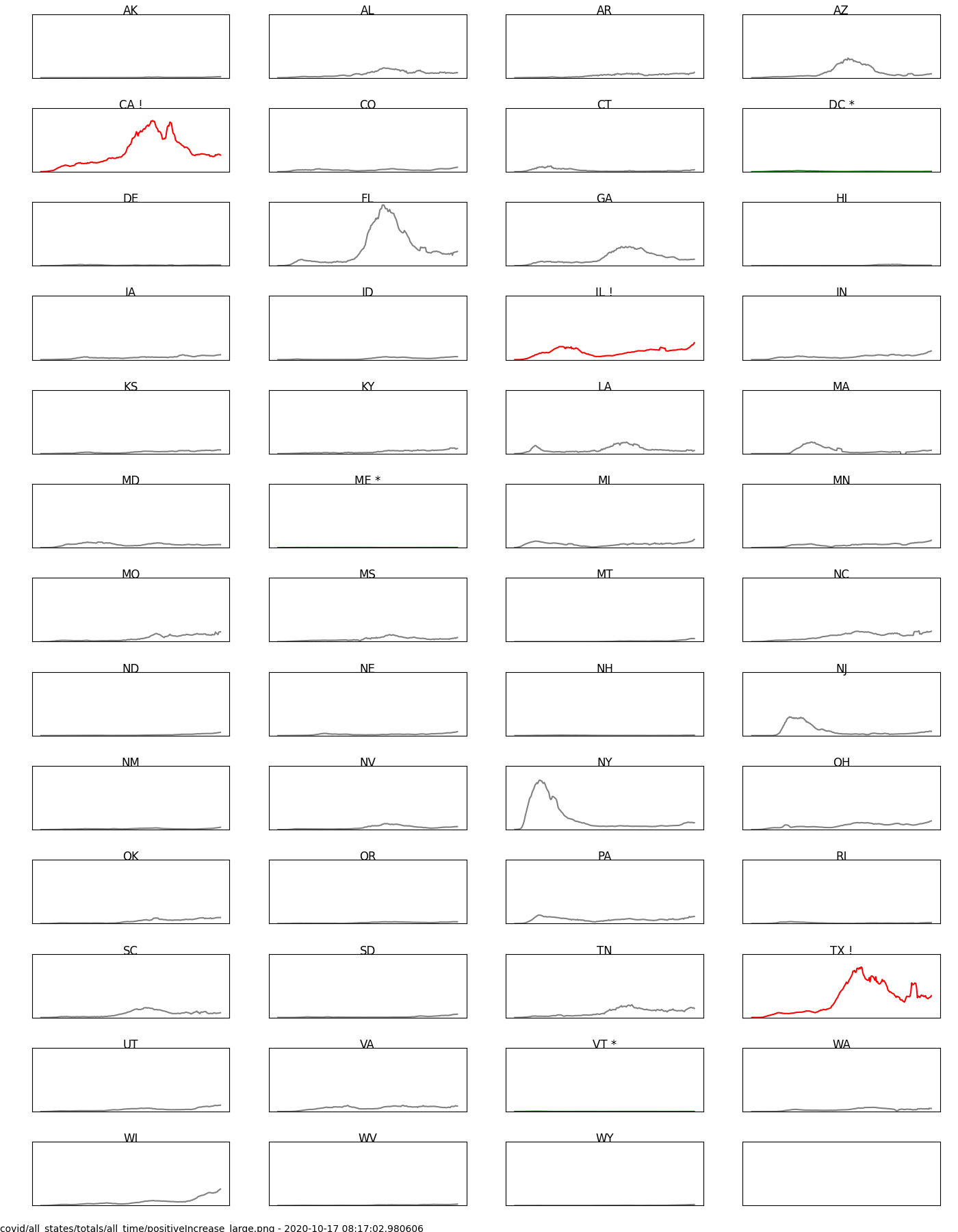
If you find the charts to be informative, you can view them on my website and see the code on GitHub.