I hate one of these AWS charts with the passion of a thousand burning suns! ☀️
Every time I look at the Lambda monitoring tab in the AWS Console, one of the charts drives my crazy.

AWS has good intentions behind the charts. These charts show the performance of a Lambda, a tiny split-second function. AWS does a decent job of providing monitoring charts to show you the golden signals of your service performance:
- Traffic is displayed in the Invocations chart showing how many times the lambda was called
- Latency is displayed in the Duration chart showing how long the lambda took to execute
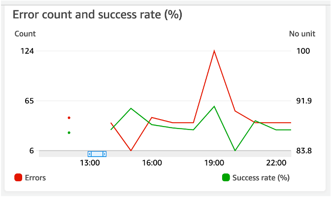
- Errors are displayed the Error count and success rate chart. Right?
Actually, it’s painfully hard to tell. The chart is so poorly designed I can’t tell if this is showing me errors, if things are going well, or if things are getting progressively worse.

Here are the major issues with the chart:
- The chart is showing two opposite measures: success and failure.
- One Y axis shows an absolute value and the other shows a rate percentage. Even with the labels at the top of each axis and the legend placement below the appropriate axis, I can never remember which is axis is which.
- The axes break scale and don’t start at zero. The green Success rate line appears to hover below 50% but is actually above 83.8%.
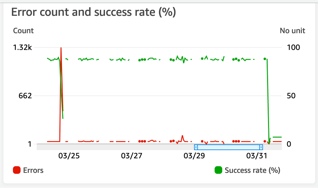
Even a chart with more successful data is still hard to understand.

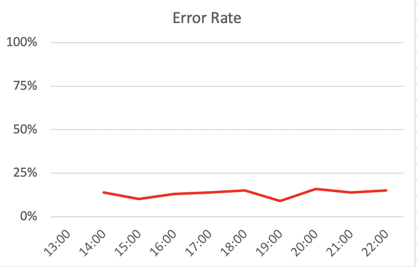
I think a better design that is more in line with the golden signals is to just graph the error rate (100% - success rate) to a fixed 0-100% Y axis.

When viewed in context with the other charts, I think you can see some better insights. My takeaway is that the system is relatively stable because the Duration and Error Rate remained stable, even while the invocations spiked.
